This week, I have been illustrating my final designs and I have concluded that my print should be in the form of typography that goes from two dimension to three dimension, which has been inspired by Andrea Ferrandis. I had decided to use my designs for typography because I wanted to link my work to the Graphic Design degree that I want to apply for.
I have decided to create two letters in order to show the viewer my intentions of creating a sample for the alphabet. I have also explored ways of producing my final design, which includes layering cardboard and Styrofoam; I was considering using wood in order to create a solid effect, however, Charlie (3D workshop technician) suggested Styrofoam because it is easier to manipulate and it can still create a solid structure.
 I have carefully spread out a plan to create my final piece. Monday, I finished producing my final illustrations. Tuesday, I cut the Styrofoam and smoothed it with sandpaper. Wednesday, I painted the background onto my fabric. Thursday, I printed my pattern on top of my background, and I pinned the fabric onto the Styrofoam. This is effective because I have considered the amount of time required for the paint to dry, and I have also made sure to cut the Styrofoam first, just incase the measurements change; I was able to calculate how much fabric I needed for each letter based on the size of the surface letters.
 I am please with how my final piece turned out because it relates to all the artists that I have been looking at, and the vibrance of the colors makes the typography stand out and the viewer feels attracted to it. I dislike this print however because I have used more white in the background than my previous sample, which has made the pattern blend into the background and has made the print appear a bit rough. I have found pattern cutting the hardest because my surface letters are an awkward shape and you need to fit the fabric around it tightly without any folds.
Additionally, I have also been life drawing, which mainly focusses on the details in the model's face using charcoal and chalk. During the life drawing session, I was mostly drawn towards the detail in the hair due to the fine strands of hair and the amount of shading and tone that needs to be included. We were given one hour to draw, and when we had five minutes left, my lecturer advised me to pay attention to the rest of the face in order to create balance. I added as much shading to the face as I could, however, I don't think I have emphasized the cheek bones correctly. In order to improve, I will attempt to spread out my timings more, so the drawing as a whole looks balanced.
Next, I am going to have a week of progression, which focusses on filling in my university application, and I am hoping to work on my sketchbook during the week;
 I have carefully spread out a plan to create my final piece. Monday, I finished producing my final illustrations. Tuesday, I cut the Styrofoam and smoothed it with sandpaper. Wednesday, I painted the background onto my fabric. Thursday, I printed my pattern on top of my background, and I pinned the fabric onto the Styrofoam. This is effective because I have considered the amount of time required for the paint to dry, and I have also made sure to cut the Styrofoam first, just incase the measurements change; I was able to calculate how much fabric I needed for each letter based on the size of the surface letters.
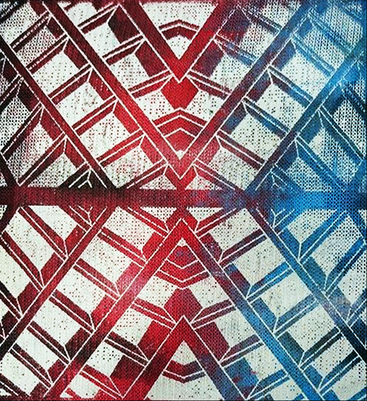
 I am please with how my final piece turned out because it relates to all the artists that I have been looking at, and the vibrance of the colors makes the typography stand out and the viewer feels attracted to it. I dislike this print however because I have used more white in the background than my previous sample, which has made the pattern blend into the background and has made the print appear a bit rough. I have found pattern cutting the hardest because my surface letters are an awkward shape and you need to fit the fabric around it tightly without any folds.
Additionally, I have also been life drawing, which mainly focusses on the details in the model's face using charcoal and chalk. During the life drawing session, I was mostly drawn towards the detail in the hair due to the fine strands of hair and the amount of shading and tone that needs to be included. We were given one hour to draw, and when we had five minutes left, my lecturer advised me to pay attention to the rest of the face in order to create balance. I added as much shading to the face as I could, however, I don't think I have emphasized the cheek bones correctly. In order to improve, I will attempt to spread out my timings more, so the drawing as a whole looks balanced.
Next, I am going to have a week of progression, which focusses on filling in my university application, and I am hoping to work on my sketchbook during the week;