For this week project, I have
been required to produce a piece of finished artwork based on the theme,
‘aleatory’, which is to be displayed within The Island gallery. Due to the
quantity of students taking part in this exhibition, I have been given the limitation
of working within the dimensions of 1 foot by 1 foot. This has provided me with the opportunity to
enrich my C.V as well as being able to expose my work to the public. The main
aim was for this project to link in with my final major project proposal, which
involves rebranding and promoting Weston- Super- Mare. I linked this ‘aleatory’
theme to my project by exploring the process of mark making, which allowed me
to focus on capturing a new perspective and composition on Weston- Super- Mare.
Even though I was not required to include this in my sketchbook, I thought it
would benefit me because it acts as a good starting point in my project and it
will allow me to justify why I have taken specific steps and it illustrates how
my ideas have adapted throughout the project. I am hoping to use this starter
project and develop it because it has allowed me to find what composition I am
trying to depict, which will make the process of rebranding easier and more
straight forward rather than having difficulty with moving out of the research
stage.
I have starter off this
project by creating a mind map and exploring different interpretations of the
word ‘aleatory’ in order to get an idea on how I could link it with my final
major project. One definition that caught
my eye must was, ‘an uncontrolled element in the details of life or the
creation of art’ because it links with mark making due to the randomness in
movement and the expression being captured within the drawing. With this idea,
I started exploring different pieces of work that explored mark making and
produced a mood board for inspiration. My mood board also looked at composition
of cities, which gave me an idea on how to present Weston. Additionally, I also
looked at 20th century posters in the hope that my work would
transform into a piece of visual communication, however, due to the amount of
time I had, I was unable to do any further research on the layout or the history
of these posters; however, I did manage to gain a general idea on how Weston
was promoted in the 20th century, which I might consider looking
further into because it will be interesting to compare the attitudes towards
Weston.
Then I researched Weston
Super Mare and its competitor’s attractions and characteristics in order to
separate the town’s uniqueness, which enabled me to have a clearer idea on what
composition I wanted to depict and it made me more confident with how I was
going to approach this week project as well as the final major project as a
well. Then I collected different compositions of the town trough photography,
which was mainly orientated to high altitude locations in order to illustrate
the three settings of the town within one single image, which wasn’t too
difficult as I was very familiar with Weston and was aware of the scenic
viewpoints within Weston. After choosing my favoured photo, I researched an
artist called Steven Jones in order to speed up the experimentation process and
to gain an idea on what materials and techniques I could see within my work. I
liked the warmth presented within his work that was created through rich oil
pigments and dynamic movement. I have used acrylic paint because using oil paint
would be too time consuming; acrylic dries quicker and is easier to manipulate.
I have also made use of his colour by presenting a mixture of delicate and
contrasting colours in order to create a dynamic atmosphere, which brings the
town to life and brings a new perspective on Weston as a whole. Weston is often
represented as a quiet traditional seaside town, however, I have captured a
composition that depicts Weston for its urban settings and gives the town a
dynamic feeling that will become attractive to young consumers; the town is of
a university status, therefore, reaching out towards students. Whether it is
tourism or locals, the town needs to become attractive to the young without
compromising the town’s unique qualities.
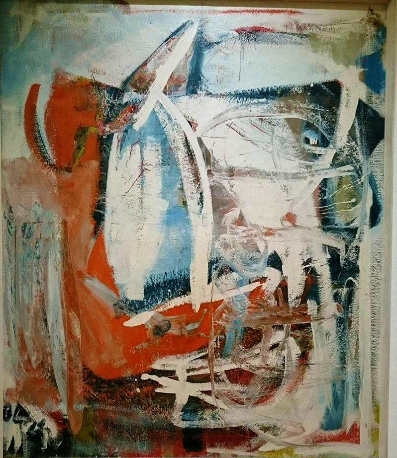
I have produced this piece by
printing out the photo on A4 paper and using the lightbox to draw the outlines
of the image because I wanted to make my work accurate in proportion and it is
less time consuming than having to correct any imperfections in your drawing.
After achieving this, I photocopied my original drawing and enlarged it to an
A3 piece of paper so it would be give me more space for my mark making. I only
had enough time to paint one piece, which ended up as my final piece because I
was too precious with my work and wanted it to be accurate and familiar to
consumers. As I was progressing through my work, I started getting impatient
because there was so much s=detail to be covered in my work and my work wasn’t
appearing professional (it looked close to a child’s painting); however, I
considered using a fine liner to go over the outlines in order to recover the
details in the buildings and to give the image a cleaner appearance, which
proved to be very effective. I am pleased with my work because I found a way to
improve my work and work my way through problems while on a deadline. I am also
pleased that I was able to use mixed media because each medium has a different
effect on the image in depth and texture, and using the same medium in a single
piece makes the image feel less dynamic and too consistent; there isn’t much
excitement I the variety of texture.
I have met the brief because I
have carefully linked my work to the final project as well as sticking to the
given dimensions. I like my work because it has a strong contrast in colours, which
enriches the pigments and places emphasis on the town’s vibrancy and gives the
town a dynamic atmosphere. This draws the consumer’s attention because the
composition of the town feels desirable; the town emits dynamic energy, which conveys
the town as fun and atmospheric. There is also a sense of direction within this
composition because the viewer’s eye is drawn towards the tallest building
(cathedral) and then they direct their attention upwards due to the negative
space adding a sense of relief from all the chaos at the bottom. The viewer is
left moving their attention in different directions because there is so much
going on t=in the image, making the town appear busy and exciting, which juxtaposes
the current concept of Weston being a quiet seaside town. This image also has a
sense of rhythm because the use of medium has been used throughout and the
contracting pigments have been spread out in order to create balance as well as
unity. It is important to consider the principles of design because otherwise
it becomes noticeable to the viewer; they feel uncomfortable looking at the
layout and the composition of the piece, which limits the amount of time they
look at it as well as reducing the likeness that your piece will be memorable. A
good design is subtle. The viewer doesn’t notice the significance of the layout,
however, the design is known for being pleasing to the eye and visually
stimulating.
The area that I was most successful
with was the research because it gave me a clearer image of what I was doing,
and it added context to my work. However, I think I need to improve the
development of my ideas because I didn’t have enough time to experiment and I
was mostly concentrating on collecting primary and secondary research. In order
to improve, I would balance my work a bit more by focussing less on the context
and experiment on different concepts. I will consider this as I go through my
final major project because experimentation allows me to learn from my mistakes
and explore what works and what doesn’t; it helps me develop my work further
and enables me to be more reflective in my work. I think balancing out this
project would have made this project less contextual and broader in my ideas, which
would have allowed me to do more experimentation. I think my weakness for this
week project was that I don’t like going through a project ‘blindfolded’; I want
to know exactly what I am doing before I start experimenting, which limits my
range of ideas and it shows that I am being too sae with this project at the
moment.
In conclusion, this week
project has acted as my first step towards my final major project and has given
me an insight on how I want to present Weston- Super- Mare. This project has
allowed me to capture different elements within one image, which adds context
to my work and shows that my compositions and my visual communication with the
consumer has improved. My strongest point is my research, which allowed me to
strengthen my work contextually, however, I didn’t explore the mark making/
experimentation process as much as I would have liked to, which constrained the
development process as well as the broadness of my ideas. In my final major
project, I will make sure to be less precious with my work and touch every
surface by balancing experimentation with research.
Next, I will attend the Bristol
gallery called, The Island, and take a photo of my piece in order to act as
evidence that my work has been displayed. Afterwards, I will go through my sketchbook
in order to backtrack what I have been investigating and resume my final major
project.


 I have also been researching a few more artists regarding logo and typography design. One is from Landor Sydney Office, they have designed an iconic vibrant 'M' for the city of Melbourne, which represents a modern version of the city and gives it more personality. The other artist is a freelance designer from Mexico, who focuses on the Art Deco aesthetics, which I found very inspiring because it has allowed me to consider what characteristics in this art movement I need to use (or what I could use) and has given me an insight on the atmosphere this movement creates and what general personality that is achieved. I was particularly interested in the typography as I was mainly researching for typography that had an art deco influence but a mixture of geometric/modern aesthetics with it in order to appeal to the young generation. I have experimented with this designer's use of typography, which I think is very suited to the town and its current state, however, I would like to create a symbol like the iconic 'M' designed by Landor; a symbol would be recognisable to consumers, and changing the typography of the town isn't a discreet identity that shows the consumers what the town has to offer and showing the name of the town means that the viewers don't have to remember the name of the town.
 My research has lead me to decipher how I can represent the town and what I need to avoid whilst doing this. I have come to the conclusion that the town is safe, however, like any other towns or cities, the night time is often filled with individuals that do not consider others and put them in danger. The town is seen as family orientated, however, visitors and locals both agree that the town could do with a few more activities for all ages, which is currently under development. I need to show the town's university status without ignoring the family atmosphere and the town's unique quality. I also need to avoid placing too much emphasis on the imagery of a beach resort because they are often seen as a tropical beach with clear blue skies, and with experience of living in the town year by year as well as researching the statics, it is clear that I am unable to represent the town as warm and sunny; otherwise it will break the brand promise and destroy consumer trust.
 Next week, I am going to explore my logo designs and see how I could represent the town through a single symbol. I am considering manipulating shape in order to create my own typography; geometric shapes are key features within this movement, and I have found that exploring typography that already exists isn't as thrilling as creating your own and it doesn't capture everything you want to say about the client. After achieving this, I will look into the symbolism and psychology of colour in order to create ambiguity within my logo as well as a positive response from the viewer; this will allow the logo to stay simple and easy to look at whilst being able to interpret that towns personality and purpose.