Tuesday, 13 December 2016

Photomedia- Week 2

During this week, I have been creating my final piece for this project, which is a time-lapse animation that films me painting my pre-drawn images with water colour; after my practical last week I have found that the process of drawing takes too long and it makes the animation longer in its length, which discourages the viewer from following the film, so I have decided to record the process of adding colour to my animation.
My tutor introduced me to a software called 'Dragon frame', which allowed me to capture images of my animation every twenty seconds, which makes the process seem shorter as you play them back in a sequence, and I am pleased that the sequence connects each image seem connected, as if movement is taking place without any time being taken out in between each image. As I played back the animation half way through, I had thought about slowing down the sequence, however, I realise that that would destroy the illusion of movement, so I have repeated some of the frames so the viewer is able to take in the final scenes properly, and this increases the length of the film, so it meets the minimum requirement of thirty seconds in length. I have also used Cut Pro software in order to edit the sounds of the animation and to make sure it is linked with the video. I haven't managed to create my own music using soundation.com because I didn't have time, and I needed to make sure that my animation was finished first so I could work out when the tone of the music is supposed to change.
I found this project difficult because I was given half the time to produce my work, which disables me from producing as much work as I would have liked to produce, and I have less time to feel engaged with the work I am doing. I have however, found this animation as a whole different and refreshing because I was given the chance to develop new skills in audio and video software as well as being able to use the darkroom, which will demonstrate in my portfolio my range of knowledge and my diverse use of materials.
In order to improve, I would put background music into my animation and manage the timings of the film more effectively. One area of success that I am pleased with is my range of research and how I have connected them in order to act as inspiration for my project. I am also pleased with how I have developed my storyboard because I have taken on my tutor's advise and made the narrative more obvious to the viewer so I don't need the narrate the animation for the viewer. I think this is effective because graphic designers don't explain stories through sound, they communicate through imagery and text, which is what I have done; I have relied on Meg Cabot's quote to sum up the story as a whole, which also allows the viewer to interpret other things into the story.

This is the link to my final animation :
https://www.flickr.com/photos/138570842@N06/31641437945/in/dateposted-public/


Sunday, 11 December 2016

Photomedia- week 1

This week, I have started a new taster project in Photo media, which is one and a half weeks long. We were given a random word each. My word was Geography, which I think is very broad because it is the study of the earth and I can base my work on anything as long as it is related to the events and the objects that are associated with the earth. It was difficult for me to choose a topic from the word I was given due to the wide selection of categories I am able to choose from. After watching Madam Tutli-Putli, I became inspired with the idea of traveling and the transformation that a person goes through when they confront their own demons and step outside their comfort zone. I looked onto Pinterest for more inspiration and I came across this inspiring quote from an author called Meg Cabot: ' Courage is not the absence of fear but the judgement that something else is more important than fear. The brave may not live forever but the cautious do not live at all. For now you are traveling the road between who you think you are and who you can be'. I intend to create a story line based on this quote, which also relates to Madam Tutli-Putli's experience as she transforms from timid into a strong woman. I wanted to base my story on an individual that has been put into a certain situation with no alternative but to step out of their comfort zone and transform themselves for the better good. I have come up with two storyboards, one talks about being courageous and preparing yourself for a university interview. The other storyboard is about a girl that is very shy and scared to talk to others, however, one afternoon she sat with a computer and a boy approaches her and asks for her number. I decided to base my work on the second storyboard because it is my own story of how I stepped outside my comfort zone and it was a large help towards my self-esteem and I feel a lot more comfortable with talking to people. I think this story is inspiring and I feel more connected with it. I have also researched the animation, 'flawed', which shows someone drawing the scenes as they narrate the story, which I wanted to use for my animation; I think moving image would be an excellent addition to my portfolio. Additionally, I have been through a dark room induction, which involved creating Photograms. I used light sensitive emulsion and exposed it for 8 seconds, which enabled me to capture detailed silhouettes. The first few times left me with a blank piece of paper because I left the red light on, which protects it from being exposed. I enjoyed this practical because I was able to learn the process of developing images, which will become useful in my graphic design course I am  planning to do as a degree. And I have found out from my tutor that this method can be used to create designs for prints. However, I decided not to use this method for my final piece because I had already explored the print making processes and I wanted to explore something new in order to produce a stronger portfolio and demonstrate that I have been exploring a range of different processes. Another practical involved recording sounds and editing them on 'FinalCut Pro' software, which time-lapses each sound in order to create something abstract. I liked experimenting with this process and that was when I became interested in using moving image and sound within my final piece; it is more exciting and I want to be able to communicate a message through this method.
I have experimented with Andrea Dorfman's use of fast paced animation by videoing myself drawing one of the scenes and increasing the speed of the video through video edting software. I don't think I will be able to hand draw all the scenes on live video because there are 20 scenes and I need to be able to fit everything in as a 30 second animation. I think I should take a photo of my scenes and set it as a slideshow because the animation would be shorter and it would be easier for the viewer to navigate themselves through the story and get a general idea of what messages are behind the animation. I will still use Dorfman's use of water colour because it dries quickly and it is easier to manipulate within a short space of time.I have also recorded Rory Marsh's voice, which is the quote from Meg Cabot; I want to show the viewer that the quote and the story are both connected in some way. And I also want to show the universities that I am able to interpret my own images using a selected piece of literature.
Next, I am going to paint all the scenes, edit them onto Photoshop and combine them with the sounds I am creating. I intend to set some background music with my animation in order to set the scene, so I will explore soundation.com and see whether I could come up with suitable background music. But first, I will need to work out how long each scene is going to be in order to let the music flow with the scenes and make the viewer change their emotion throughout the animation. 


Sunday, 27 November 2016

Adornment- Week 3


This week, I have been illustrating my final designs and I have concluded that my print should be in the form of typography that goes from two dimension to three dimension, which has been inspired by Andrea Ferrandis. I had decided to use my designs for typography because I wanted to link my work to the Graphic Design degree that I want to apply for.
I have decided to create two letters in order to show the viewer my intentions of creating a sample for the alphabet. I have also explored ways of producing my final design, which includes layering cardboard and Styrofoam; I was considering using wood in order to create a solid effect, however, Charlie (3D workshop technician) suggested Styrofoam because it is easier to manipulate and it can still create a solid structure.
I have carefully spread out a plan to create my final piece. Monday, I finished producing my final illustrations. Tuesday, I cut the Styrofoam and smoothed it with sandpaper. Wednesday, I painted the background onto my fabric. Thursday, I printed my pattern on top of my background, and I pinned the fabric onto the Styrofoam. This is effective because I have considered the amount of time required for the paint to dry, and I have also made sure to cut the Styrofoam first, just incase the measurements change; I was able to calculate how much fabric I needed for each letter based on the size of the surface letters.
I am please with how my final piece turned out because it relates to all the artists that I have been looking at, and the vibrance of the colors makes the  typography stand out and the viewer feels attracted to it. I dislike this print however because I have used more white in the background than my previous sample, which has made the pattern blend into the background and has made the print appear a bit rough. I have found pattern cutting the hardest because my surface letters are an awkward shape and you need to fit the fabric around it tightly without any folds.
Additionally, I have also been life drawing, which mainly focusses on the details in the model's face using charcoal and chalk. During the life drawing session, I was mostly drawn towards the detail in the hair due to the fine strands of hair and the amount of shading and tone that needs to be included. We were given one hour to draw, and when we had five minutes left, my lecturer advised me to pay attention to the rest of the face in order to create balance. I added as much shading to the face as I could, however, I don't think I have emphasized the cheek bones correctly. In order to improve, I will attempt to spread out my timings more, so the drawing as a whole looks balanced.
Next, I am going to have a week of progression, which focusses on filling in my university application, and I am hoping to work on my sketchbook during the week;


Wednesday, 23 November 2016

Penzance

This week, I have been in Penzance as part of a college trip, which involved looking at galleries and sketching the scenery. I decided to collect as many photos as possible in order to use it as a reference for other sketches. This week was set as a one week project, which focused on the main characteristics of Cornwall, and I decided to pay my attention to the color; I admired the strong vibrant colors of the countryside and I wanted to take advantage of it. 
As I started going through this project, I began to get more attracted to the Cornish waters because of the natural movements, the color and the way the surroundings naturally blend with it.
At the end of the week, after collecting all my primary resources, I was set a task to paint on three tiles. I decided to use the drawings as a reference for my paintings mainly because the hostel had no computers to show my photos and my camera was low on battery.
My first tile was a painting of St. Michael's Mount, which was produced using acrylic paint and a paint brush; I would have preferred to use oil [paint because it has a richer pigment, however, the college wouldn't of had enough room to put them, and they are expensive for the college to provide.
My second tile was mixed medium because all the palette plates were put in the bin and I spent most of my time on my first tile. I used pencils in order to draw a rough outline of the boat, and to create a clear transparent reflection in the water.
And the third tile was an accident. I was doing the under coatings of the tiles because I didn't want the wood to soak in all the paint, and I wanted my paintings to be clear. As I was painting these undercoats, the paints got mixed up and now it looks like a shore in Cornwall; I wanted to keep this third tile as it was because it Cornish colors were present and it reminded me of the fog covering the shore that same day.
I enjoyed this trip to Penzance because I was able to get to know the people on my course as well as being able to make new friends, and I think this has enabled me to be more confident with socializing and interacting with people; before this trip, I always felt that I needed to be invited into a conversation and relied on others to make me apart of a group. I have enjoyed looking at Cornwall's beautiful scenery and walking through the villages.
On another note, I disliked the trip because some people on the course decided to get drunk every night and gather everyone into the room next door from mine, which was inconvenient, however, it gave me a chance to get to know the people that weren't as social as other students of the course.
Next, I am going to continue with my previous project and attempt to illustrate my designs. I will also keep my sketchbook from Penzance and consider using the resources and artists that I have collected. One thing I think I could have improved on was making all my tiles vibrant in color rather than focusing all my time onto one tile; part of this project was to focus on color and I don't feel that I have taken full advantage of Cornwall's natural beauty. In order to improve, I should have balanced my time more effectively and use the painting that was in my sketchbook, which was an image of St.Ives' shore.


Week 2- Adornment


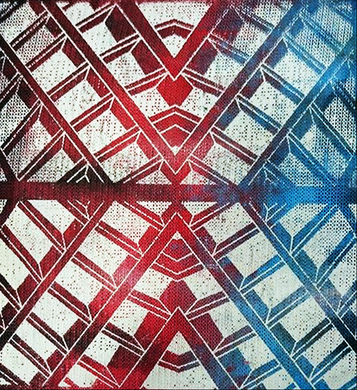
Last Friday, I managed to hand in my screen print, which was inspired by high tech architecture, and Richard Sun's work enabled me to think about how I could use this movement as repetitive patterns. I decided to design a background for my screen print because I didn't want my final piece to be plain and I wanted my piece to build up layers, like Christopher Wool's artwork.
During the week, I decided to experiment with Christopher Wool's use of color and use it for my background, but I wasn't too sure what markings to make or how it should look like, so I went into more research and became inspired by Cody Hooper's use of natural form, which I tried to interpret into my own work.
The two prints are my two most successful pieces of work because of the use of tone and the way the colors balance the print as a whole. I also like these prints because they allow the architectural pattern to come through without blending into the background.
Additionally, I have also been through a workshop in life drawing, which involved drawing the model in three different positions and connecting each position to a stick he is holding. I started off using chalk, so it would be easier to overlayer my drawings. Then I used chalk to create strong outlines, and I also used graphite pencil to create detail and depth. I preferred using graphite pencil because I enjoy paying attention to detail, and I think I was mostly drawn towards the model's hair due to the shading, highlights and hair strands that needs to be considered. I think I am becoming more comfortable with life drawing because I realise how much it is improving my drawing skills and my use of perception, which is a tranferable skill for illustrating my designs or collecting primary resources.
Next, I need to choose a design that most appeals to me and then think about how I am going to use this print in my final piece. I have been thinking about linking this project towards visual communication because I want to strengthen my portfolio for when I apply for university. I will research more artists and see how I can apply my designs in relation to what I want to do (Graphic Design). I am unable to continue with this project this week because I am traveling to Penzance for a college trip, so I will need to backtrack to where I left off and make a note on what I am focusing on and what I need to do for the last week of this project. One thing I do need to also consider is annotating my sketchbook because I have organized where everything needs to go , however, I haven't had time to do any writing, so I will also write out a plan and attempt to balance everything.

Monday, 7 November 2016

Adornment- Week 1

This week, I have been introduced to a new project, which is a taster course in fashion textiles and surface design, and the brief is called adornment. Adornment means beautification, and I am considering reusing materials and giving it a chance to start a new life.
I was given an artist called Christopher Wool and an architecture movement called High Tech, which acts as my starting point to the project and has been done in order to challenge my problem solving skills, which is a transferable skill in a designing career. After much thought I have decided to combine these two contrasting styles by using the same colors Christopher Wool uses (red, white, grey, black, and blue), and I am making use of the architectural patterns.
I have been through a printing workshop, which combines image and blank screen printing. I prefer my second print because it is related to  the architecture I was given and it has sections of abstract art.
I have also done a life drawing session using graphite pencil, which was easy to use and it creates bold outlines. For this session, we were looking at the way fabric droops around the model, which is a transferable skill for illustrating fashion. I like this drawing because of the detail in the face and the way the hair strands are defined. My tutor advised me to focus on putting detail into the face and working downwards because an illustration is supposed to have personality, so the viewer knows who the individual is and what type of person the product is for. I dislike it however because it feels incomplete, making it in-balanced and unnatural.
I have also completed my sewing introduction, which has enabled me to experiment with my ideas. I started off using an embroidery hoop with a sewing machine, which I found difficult to control because you have to make sure the fabric is tight and the hoop needs to remain flat. I have decided to create triangular shapes in order to emphasize the geometric patterns within high tech architecture. I have also cut out smaller triangular shapes and added it to my free hand embroidery in order to add colors inspired by Christopher Wool. I like this design because it relates to my architecture and my artist, and it also goes with the theme adornment because I am re-using fabric and giving it a new purpose. I also like this design because it is playful and attractive to the viewer. I might consider using this technique in my work because it is colourful and has different techniques used within this work. However, I am leaning towards using screen printing because I want to build up my printing skills for the Graphic Design Degree that I am hoping to be apart of next year. In addition to building up my portfolio, I have decided to transform this fashion/ textiles project in my favor and make it relevant to visual communication. I plan to do this by designing a pattern and shaping it in the form of typography, which demonstrates I am able to be adaptive and it will strengthen my portfolio.
Next, I am going to design an image for a silkscreen and explore how I can play with this design. I also think I need to start researching more artists because I am required to have a minimum of six artists. I can start by researching how I am going to transform my patterns into typography and what textures I could use.

Sunday, 9 October 2016

Just my type/ Music to my eyes- Week 3


This week I have been producing a final piece to both of my projects. I spent Monday (17th October 2016) experimenting with embroidery, which is the background that I planned to use for the illustration project; I was unsure what type of vibration pattern I could use and I wanted to make sure that I didn't make any mistakes on my final piece. I ended up choosing a vibration with three different lines because it looks more appealing and it shows the different wavelengths within the song, 'Quiver a little'. I started to produce my final piece for my Illustration project last Tuesday because I wanted to make sure I had enough time to produce my Graphics project on Thursday. I started making the top layer to my final piece, which is the silhouette of Benjamin Clementine; however, before doing so I had to find a different silhouette of the singer because my tutor pointed out that the composition was wrong and didn't have a lot of definition in the face. I have used ink and a stick to produce the outline of the singer, and I attempted to shade my work in using a damp tissue, which worked for me last time I practiced it, however, the ink was misbehaving and it kept smudging. Knowing I had little time to start again, I continued to work on my piece and decided to go over it using white poster paint, which cleaned the appearance of my work. And I also mixed white paint with a bit of the blue ink because I wanted to use the same colour and continue adding shading to my work without worrying about the ink smudging; when paint is added, the ink doesn't absorb through the paper and it is thicker, therefore easier to handle. I was very pleased with my work and I was very glad I hadn't thrown my work away as it has given me the opportunity to add an extra medium to my piece as well as being able to problem solve. I have also decided to add graphic fine liner to my work because I wanted to emphasize the outlines and create a contrast with the colour.
Another piece of feedback from my tutor was that I needed to include the name of the song within the illustration because the silhouette disables the viewer from recognizing Clementine, so I decided to use the vibrations to spell out the word 'Quiver' because it blends into the background, and I didn't have enough room to spell out the entire title of the song. I spent Tuesday and Wednesday night doing my embroidery because I wanted to complete my illustration project before Thursday, and I had the materials that I needed at home. I used the rest of the purple fabric that I had from last year, which turned out to be more than enough. I measured out 45cm by 45cm and I used a embroidery hoop to stitch the background; however, I drew a rough outline with pen because I didn't want it to rub off whilst I was focusing on one section and I wanted to make sure that the lines were straight.
  
I went to three different art galleries last Wednesday, which were Arnolfini, M-Shed and Spike Island, all of which I had already visited before. I wasn't quite sure why we were required to visit the M-Shed since there is very little art work there, however, I did manage to spot the Bristol banner for the Co-operative society 1926, which was used for social or political events; I like how it communicates to the viewer because the parallelism and the image used within the banner are both associated with how everyone should look out for each other, and it gives the viewer a feeling of connectedness and being down to earth. I also like this image because it has clear narrative, but also has hidden ambiguity within the image, making the image understandable and also challenges the viewer to read more into it: the women in the center could represent mother nature or some other source of high power, and the image indicates everyone working together to create order and work together to build a stronger community.  I found work from Daphne wright very dramatic because it focuses on complicated social issues that occurs very regularly. One piece of artwork that did catch my eye was the primate that was created in 2009 from marble dust, onyx, resin, silk embroidery and paint. Primate is associated with a rhesus monkey that was being used for animal research and then being put to sleep after it fit its purpose. The skin of the monkey has been stitched onto this sculpture, making the sculpture feel lifelike and exploiting emotion from the viewer. I like this work because it is showing the viewer how mankind is using these animals and this makes the viewer feel ashamed and astounded with how we approach today's modern society. I also like her work because of how she makes use of mixed medium and uses it to her advantage; she is giving her work more texture and layers that makes it look authentic and exciting to look at. I am not going to use her as an influence because I have already chosen my final idea and I am in the middle of creating my two final pieces, however, I will consider using her as a reference to my next project; I like how she addresses important issues and communicates them to the viewer visually. Spike Island was an exhibition that was entirely focused on Hedwig Houben, who focuses on producing sculptural works with videos of the artist to explain or to show what each artwork is about. She mostly works on producing markings subconsciously. I like her work because it is weird and abstract; she has produced a new kind of art that challenges the viewer's perception. She has taken away all her thoughts and feelings in order to produce artwork that is purely focused on the markings instead of trying to make  the viewer respond to the artwork emotionally. I like her work because it is disconnected from the world, which makes her artwork feel surreal. It challenges the idea of what art is supposed to be because the main objective is to express yourself however Houben has destroyed this objective in order to show the viewer that art can be absent minded.
Last Thursday, I started working on my Graphic Design project which was a bit of a hassle because I had to quickly change the design of my background; the chairman of the Conservative Club said I couldn't use the union jack as the background because some people might think it s offensive. I quickly reverted to my other background, following the conservative colours, however, a member if the conservative club commented that the design was wrong because it had the same colours of the Scottish flag. On that note, I continued to use the same colours and layout, however, I decided that I should make the colours in my design broken up with a pop art appearance and oil paint would be the best medium to exploit all the rich colours and contrasts that were in my design. After finishing my oil painting, I took a photo of it using my Nikon camera because I knew the background wouldn't dry quickly and I wanted to overlay my background with a digital design of my typography. I decided to use Photoshop to create my typography because it is professional photo editing software that allow me to manipulate my objects. I edited an image of an empty glass, which I layered over the digitalized background, and then I layered the empty glass with an edited image of a full glass. After making sure both layers were the same size, I used the eraser to carve the top layer into letters, which enables the viewer to see the bottom layer. I am pleased with the final result because it goes with my theme manipulation and it looks so surreal; ale can't physical change form like that. I have also managed to complete a separate piece for the conservative club, which has the same typography and background. I have showed the chairman my final piece and he is pleased with it. He plans to use this as the front cover for the Weston Conservative magazine as soon as he can get hold of the information that will go into the magazine, which I think should be done before the start of November.
And I spent last Friday digitalizing my illustration project and adding it to a template. I am planning on using half term to finish annotating and evaluating my sketchbook because I wanted to spend the time I had on exploring materials. I found doing two projects at once difficult because you have to remember what artists you were looking at and then divert back to the other project, however, I think I have had the right balance between the two. I think I could improve by balancing the experimentation with the annotation because reflecting on your work enables you to improve and develop your work more, and it is difficult to write what you were trying to do after a couple of weeks. Nevertheless, I am pleased with my work and I am glad that I have been able to communicate many messages within my illustration as well as given purpose to my typography. I have enjoyed both projects, I think I have enjoyed the illustration more so because I was able to express myself more, however, I am determined to move towards Graphic Design because I like the idea of persuading the viewer through imagery and I don't think I should judge Graphic Design through one project. I will keep Visual Communication as my main choice and then confirm which area I want to take once I start my projects in Visual Communication, which should be in January. I will look for Graphic Design Courses for university before Christmas because illustration can be a part of Graphic Design, however, Graphic Design is deliberate and sets specific messages to the viewer, so I will bare this in mind. Overall, this project has allowed me to look at both areas of Visual Communication and be reflective on my work.