Monday, 5 June 2017

22nd - 26th May 2017

This week, I have printed out my poster and brochure, which were placed onto my display. I found putting up my display difficult because at first the shelf was unsuitable to put up because it didn't have a flat surface to put a nail through, so the technician was kind enough to make me a new shelf. 
I also found this display difficult because the layouts for my brochure were always uneven and wonky, so it took a while before I was able to make the display straight and alligned with each other. 
 I have added a clothing label to my t-shirt because the brand of the t-shirt was clearly visible, which clashed with my display and made my brand feel less authentic. I created my label by using a template on Google, which allowed me to gain a vague idea on how the label should be layered out in such a short time. I used photoshop because it had all the tools that i needed and it enabled me to edit my logo and apply it to my label.
I have also added my logo onto the top of my second wall because it was feeling a bit bare. and adding my logo to the display makes it clearer to the viewer that my display is about rebranding. And they will be able to see the original version of my logo because i had to alter the colour scheme in my poster design in order to create rhthym and balance in my design. I have mounted my logo onto foam board in order to create a consistent surface next to the mounted brochure layout, and it was printed onto A3 paper in order to place more emphasis onto it; a larger scale makes the logo stand out when it is compared to my A4 brochure layouts. This directs the viewer from top to bottom instead of starting from the middle; if most of the emphasis is placed on the middle, then the consumer will have lack of direction, reducing the flow and movement of the display.
Additionally, I have also produced mock-ups for my poster in order to visualise where I would place my poster if I had a bigger budget. I have concluded that my poster should be placed on a bus stop because it is sheltered, which would protect my poster from weathering, and the public are more likely to notice my poster because they have to wait for the us. I would also place these posters in locations such as bristol or Taunton because they are situated close to the town, which makes it more convenient to visit and it would encourage them to visit more regularly.
I have also asked a student to model my brand for me, which allows me to see what my brand looks like when it is being used, and it makes my brand more real. I have considered adding this model image to my display, however, I am concerned that i wouldn't have enough room on my display. Instead, I am going to model my brand myself once I am required to watch over my display; it allows the viewers to see my brand being used, making it feel more practical.
Next, I am going to finish my sketchbook and write an evaluation.


Monday, 22 May 2017

15th - 19th May 2017

This week, I have been allocated to my space for the display and I had to paint the boards using sand paper, gum tape, masking tape, filler, paint brush and a roller. Sand paper allowed me to smoothen the wall and get rid of any excess paint, which also revealed several pins and nails behind the paint. I filled in the holes made by previous nails, and placed gum tape along the sides of the walls ; however, I had to place gum tape along the sides of the walls in order to make it more secure and to avoid the tape from slipping when paint is applied. A paint brush was used to reach tight edges, a roller for creating a smooth finish, and masking tape and newspaper to protect the floor from any paint. I found this experience overtiring because I had to do a lot of stretching (even while standing on a chair) in order to reach high spaces. I was unable to place any gum tape on the top due to my height, however, the display looks acceptable without it.

I have also learnt how to fill in my brochure with text without having to write my own content (placeholder text); it saves time and my brochure will only be assessed on colour and layout. And after doing more research on brochure design, I decided to apply and explore different types of medium because I like the delicate effect the background has on the brochure, and I think it will represent the rural features of the town such as water and the countryside. I also think this will soften the effect of the art deco style within my brochure and will make my brochure feel friendly and inviting to consumers. I have been experimenting with pastel, watercolour, and acrylic paint, which have been edited on photoshop; I wanted to explore what effect each medium brings to my brochure. I had concluded that watercolour would be my primary medium due to the light and delicate palette it brings to my work.  I have placed this work as a background onto my brochure in order to bring colour to it, which I have been trying to edit so the text could be seen clearly. 
I have finally finished my poster and concluded that the slogan 'take a ride around...' should be included; it is inviting for the consumer and it acts as an ambiguity because the consumer could ride using a donkey, car, train, tram or the pier rides. I had originally planned to include 'weston super mare' at the bottom, however, this was removed when I came to the conclusion that the logo would imply the location of the image.
Additionally, I have changed the typography of the slogan in order to suit the style of my logo and to create consistency within my work. I also prefer this typography because it brings less weight to the image, making the poster feel unified and balanced as a whole.

At the moment, I am trying to decide whether the slogan should be in the top centre or the top left, however, once I have made my final decision I need to send my design off to the print room in Knightstone campus; Knightstone Campus has specialised equipment that will allow me to print on A1 paper.

Monday, 15 May 2017

8th - 12th May 2017

This week, I have been through a presentation about moving on towards university, which talked about note taking and speed reading as well as allowing me to try these techniques for myself. This is effective because being active makes it easier to remember this information. I was able to practise my note taking and I have learnt a new technique called 'Cornell notes', which is slightly more complex than my original method; however, this method will allow me to understand what the lesson was about when I look back at my notes because it requires me to write down a brief summary of my notes after the lesson.
Additionally, I have been moving studios so the walls can be altered for the summer show, which has taken a lot of time away from my project and I have had to limit the amount of space I have been working in. I have also had to clear away my shelf, which is filled with all my project throughout the year.
Most of my work has ended up in the recycling bin mostly because I have my best work in my university portfolio. I have also been busy balancing my work with finding university accommodation, which I have secured. I have signed and posted my first contract and will start moving in on 7th July; this will allow me to settle in Falmouth and understand how to live with my fellow flat mates, and it will be easier for my Auntie and Uncle as they will no longer receive funding for my keep. Hopefully, I can find a job to occupy most of my summer because I will not receive my loan until September and want to place less strain onto my savings. I am hoping to visit my new accommodation soon so I can work out what essentials I need such as a cooking set.
I have managed to design my layout for the brochure and I am considering using my poster image for the front cover in order to show consistency within my designs. However, I am currently working out what I am writing in my brochure and the colours I am going to use. I have also finished my oil painting of Weston, which I have photographed and edited. I was planning on booking a photo studio so I can take a decent picture of my painting, however, it doesn't seem available on the website techbookings.weston.ac.uk, so I had to take a photo with my own camera. After editing it on Photoshop, I decided to convert the image's size to A1 paper in order to get an idea of what the image would look like once converted in an A1 poster. I have found that my image was too pixelated, so I dragged my photo onto Fireworks software and now I am currently making the colours flat using a paintbrush, which has a similar effect to Anderson's group.
Next week, I need to fill in and paint the walls for my display, and finish my poster and brochure. After much consideration, I have decided not to design a website because I had given myself too much to do and wasn't considering the disruptions within this project. So I will spend next week editing the layout of my poser and brochure and start researching for my display. My t-shirts and mugs have arrived (bags should arrive next week), so I should arrive next week), so I should have enough for my display.


Wednesday, 10 May 2017

2nd May - 5th May 2017

This week, I have been to the Oxford trip and explored three galleries/museums: Ashmolean (museum of art and archaeology), Pitt Rivers museum, and Modern art Oxford. Ashmolean did have a few interesting things but nothing that could have inspired my work; it was mostly prehistoric art, full of pottery and sculptures. Pitt Rivers Museum was filled with stuffed animals and brains, which was very uninspiring. And the Modern Art Oxford gallery had closed their exhibition, so there was only a piece of photography available on display, which are portraits of individuals that visit the local fish and chip shop, placing emphasis on the different identities. This inspired me to take photos of Weston to represent each personality or characteristic; it makes the consumer feel more informed about the town and more engaged, which secures their decision to visit. I have captured different snapshots of Weston using specific adjectives that describe Weston. This technique is effective as it will make my brochure more visual and it will increase the consumer's level of interest and allows them to absorb information easily. 
The Ashmolean handout has also allowed me to make a note of what I need to include in my brochure such as a map to show all the main attractions ad restaurants; it makes it easier for tourists to navigate themselves through the town. And I also need to highlight the activities available for each age group, which makes it easier for visitors to decide what they want to do in their visit.
I have been experimenting with slogans because I thought it would give the consumer more information on the town's character, however, the shape of the logo makes it difficult to unify a slogan to it. And I don't want to use too much varied typography because it can ruin the effect of the logo, and I feel that a simple logo can be powerful and full of ambiguity on its own.
I have also went around town taking more photos in order to capture the town's main characteristics, which I am planning to use in my brochure. I have been looking at brochure designs and I find that the geometric design most appeals to me because it goes well with the Art Deco movement and brings a modern approach to promoting the town.

I have also designed my t-shirts, bags and mugs on vistaprint.com because I am unable to create the same shadings using screen print, and I think it would look cleaner and more accurate to my design if I have them professionally printed.
Next week, I am going to note down what I need to include in my brochure and create layouts for my brochure.


Thursday, 4 May 2017

24th - 28th April 2017


This week, I have explored more into my typography by playing with the collaboration of shapes; it takes the style of art deco architecture with its use of shape and form. As I started off exploring shape, I found it difficult to make the typography clear to read, however, I have reflected on my mistakes and figured out how I could make each shape more recognisable as a letter. I had decided to use the initials of the town for the brand because it acts as a symbol and makes it easier to recognise; the long name would need to have smaller font in order to fit a specific scale. Additionally, a symbolic modern, which allows the consumers to recognise the way the town is progressing, and in time will lead on to regeneration and further investments.
I have also been looking at the colour theory in order to follow the semiotic theory of interpretation within visual communication, and I have concluded that blue would be most appropriate as the town has been famous for its fresh clean air throughout history and a calming atmosphere .  I had decided to create a gradient within this symbol that diverts from sky blue to vibrate blue because I couldn't decide between both shades; however, this has an interesting effect as it appears like the sea, which indicates the town having water element.  was at first unsure about the colour once I printed it because it looked too modern and neutral like a computer company, however, once I had experimented with the layout, I had managed to capture a sense of warmth by creating a circular outline; its feels community based and represents the warm atmosphere that locals recognise.
I have also decided how I am going to promote my brand in consideration of what is in trend and what isn't. My research tells me that postcards are no longer favoured due to the advance and convienience of technology., and billboards are known for 'visual pollution', which is why it has been banned in places such as Bristol and Brazil. I have decided to create my own website that can be adaptable to mobile phones as it is on trend at the moment and it will be easier for people to know what is available and what events are taking place. I am also going to create a Facebook page that is linked with my website because most of my target audience are using social media, which allows me to communicate with them more effectively through advertisement and notifications that are relevant to them. I have also decided to create a poster and a brochure in order to inform and persuade. Brochures can be placed in many supermarkets around North Somerset, which is where families are most likely to be and this will encourage them to visit the town as it is cheap and family orientated.

So far I am using the same composition I used in my aleatory project because I need to capture the town from a far distance and i had already concluded that this was the best view of Weston as it shows the consumer most of the centre as well as the country and seaside elements. However, I am trying to make the colours blocky in order to suit a artist I have recently been looking at (an illustrator within the anderson group ) that creates 20th century style posters with oil paint. I have been exploring my use of colour for my poster and seeing how I can match the colours with the town as well as getting the right colours to match the logo.
Next week , I will confirm my use of colour for my poster and start painting it using oil paint, which is the same medium that the anderson group uses. I will also use software to work out the layouts of my bags, cups and t-shirta in order for my products to deliver in time for displaying my work;  printing my work professionally would allow me to show the delicate gradient within my logo as screen printing techniques do not have the same effect. i will also attend the trip to Oxford, which I hope will inspire my work. The logo design I have chosen as my final piece is the last photo (at the bottom), which will be placed onto posters, broachers and promotional items.

Tuesday, 25 April 2017

17th- 21st April 2017


This week, I have finally finished my researched and I have concluded that I need to create a brand that focusses on Weston's architecture because it is a key feature that is unique to the town. One advantage to this art deco style is that the logo will come out as modern as well as welcoming and friendly, which is the key approach to this rebrand as many visitors fail to see the welcoming atmosphere that locals experience.
I have also been researching a few more artists regarding logo and typography design. One is from Landor Sydney Office, they have designed an iconic vibrant 'M' for the city of Melbourne, which represents a modern version of the city and gives it more personality. The other artist is a freelance designer from Mexico, who focuses on the Art Deco aesthetics, which I found very inspiring because it has allowed me to consider what characteristics in this art movement I need to use (or what I could use) and has given me an insight on the atmosphere this movement creates and what general personality that is achieved. I was particularly interested in the typography as I was mainly researching for typography that had an art deco influence but a mixture of geometric/modern aesthetics with it in order to appeal to the young generation. I have experimented with this designer's use of typography, which I think is very suited to the town and its current state, however, I would like to create a symbol like the iconic 'M' designed by Landor; a symbol would be recognisable to consumers, and changing the typography of the town isn't a discreet identity that shows the consumers what the town has to offer and showing the name of the town means that the viewers don't have to remember the name of the town.
The photos shown on the left side are sketches of my ideas and exploration of typography. I am interested in potentially creating iconic symbols like the 'M', however, a simple 'W' will not be enough to represent Weston Super Mare as there are other towns will the same initial and the town's name is to long to go by one letter, so I might need to use three letters instead (W.S.M); it will be recognisable to the consumer.
My research has lead me to decipher how I can represent the town and what I need to avoid whilst doing this. I have come to the conclusion that the town is safe, however, like any other towns or cities, the night time is often filled with individuals that do not consider others and put them in danger. The town is seen as  family orientated, however, visitors and locals both agree that the town could do with a few more activities for all ages, which is currently under development. I need to show the town's university status without ignoring the family atmosphere and the town's unique quality. I also need to avoid placing too much emphasis on the imagery of a beach resort because they are often seen as a tropical beach with clear blue skies, and with experience of living in the town year by year as well as researching the statics, it is clear that I am unable to represent the town as warm and sunny; otherwise it will break the brand promise and destroy consumer trust.
Next week, I am going to explore my logo designs and see how I could represent the town through a single symbol.  I am considering manipulating shape in order to create my own typography; geometric shapes are key features within this movement, and I have found that exploring typography that already exists isn't as thrilling as creating your own and it doesn't capture everything you want to say about the client. After achieving this, I will look into the symbolism and psychology of colour in order to create ambiguity within my logo as well as a positive response from the viewer; this will allow the logo to stay simple and easy to look at whilst being able to interpret that towns personality and purpose.


Sunday, 16 April 2017

10th - 14th April (Easter Hoilday)


This week, I have been doing more research into the history of Weston Super Mare by reading several books and organising every event onto one timeline, which was time consuming, however, it has allowed me to clearly see how the town has progressed and the characteristics that have remained after so many years. The one thing I have learnt is that the donkeys we know on the seaside were once used to carry the fisherman's catch of the day during the 18th century (not the same donkey's obviously), showing the relevance of these activities and proving that the town does provide activities that allow people to interact with history; however, one thing I should suggest is that the tourists were informed of this history and the significance of these activities because I wouldn't think that even the locals know of this history, and it would make the tourists feel inspired by each visit.

I have also looked through my sketchbook and added a sticky note to explain how I could use my research, which allows me to get ideas on how I can move on and it allows me to move on faster because I only have 5 weeks left after coming back from holiday! I will primarily be focusing on my research and ideas during this project because after I display my work, I will have the half term in May to finish my sketchbooks so I can prioritise practical activities rather than annotation; as long as I keep a brief note on what my thoughts are then it will be easier to get back to.


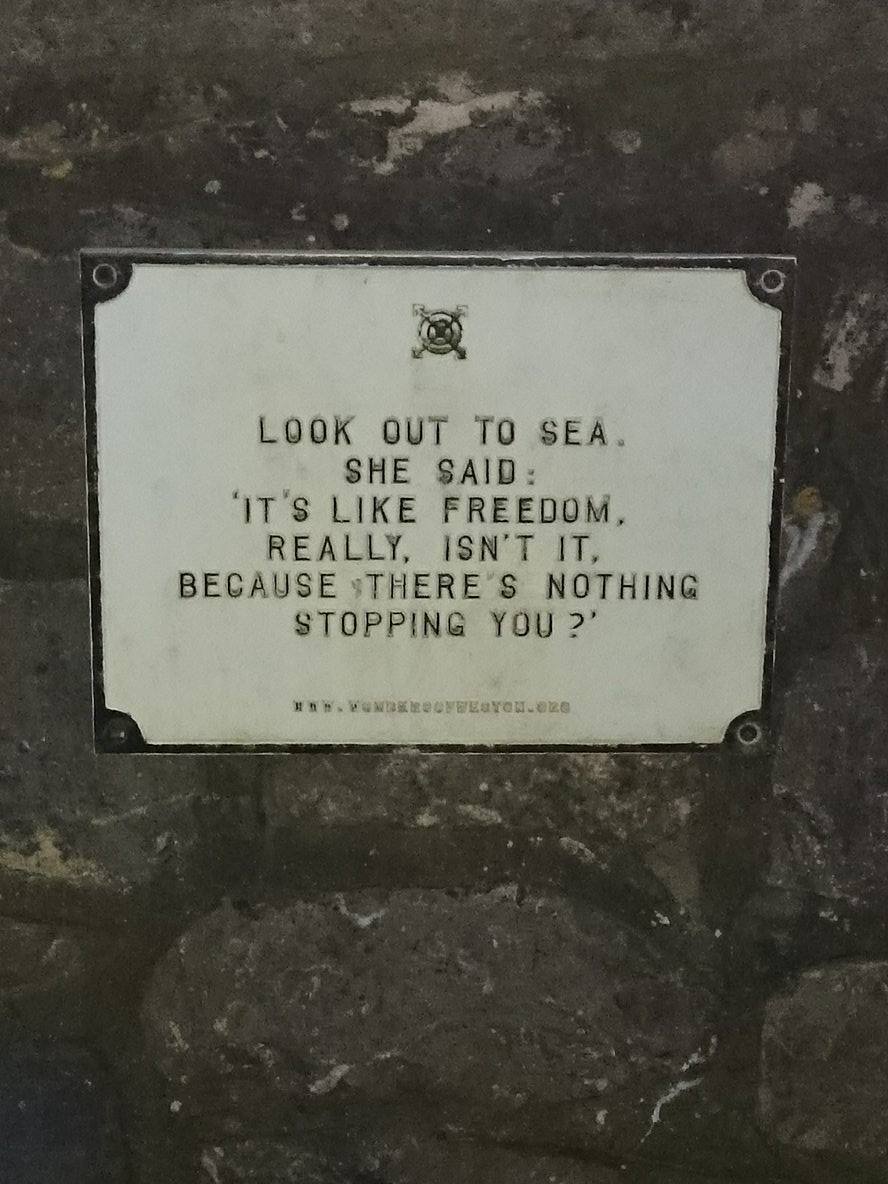
Additionally, this week I have come across signs from the 'Wonders of Weston' project whilst walking on along the beach. It amazes me that I had never seen them before, however, I feel that doing this project has put me into the mindset of a tourist and I have become more observant and enthusiastic about my home town, which contrasts with the attitudes of the locals as they see the town as everyday surroundings. The project was set up in 2008- 2010 in order to revitalize seaside towns. These signs were created by Wrights & Sites based on the town's characteristics. The project is called 'how to build a town' and it is meant to challenge ‘the assertion of regeneration to improve upon or to replace what is already in existence’; the viewer is taken through historical and contemporary stories behind each piece of architecture, making the viewer think and place value on each area.  I like these signs because they are imaginative and make the viewer consider the architecture more. These signs have certainly made an impression on me and the more you try to read into these signs, the more you want to find out about the history of the town. In a way, these signs have been rebranding the town because they are making the viewer see areas of Weston in a different perspective.
I have also been researching an abstract artist called Kandinsky, who focuses on colour, form and symbolism. I am considering using symbolism in my work through semiotic theory because I am interested in conveying what isn't accurately within the image in order to create a simple and powerful brand; I want to be able to depict Weston's character and personality in a simplistic manner, making the viewer feel comfortable looking at the design as well as being able to interpret what the town is about and the atmosphere that is given out as soon as you step into the town centre.
Next, I am hoping to research the different methods in which Weston has promoted their town throughout history, which will allow me to gain an idea on how communication has changed and what the current trend is. Additionally, I have used the data from the survey to collect other secondary resources regarding crime rate, weather and population, so I am hoping to read more into that in order to identify whether the town is a safe place, whether I can represent the town as a sunny seafront, and identify at what caused the town to have a rapid increase in population. I will make a mind map in my sketchbook saying how I could represent the town without going against the brand promise, which will give me a clearer idea of what I need to do, and it acts as a piece of visual information that I could reflect back on throughout this project. I was hoping to do more this week in ways of idea generation, however, it is more important to get my research sorted in order to further my understanding and to make my idea generation more relevant to what I am trying to achieve. I might consider using the Wonders of Weston quotations within my project, or highlight the importance of different aspects within Weston;  I am very interested in the poetic language that this group has used and it has made me think about what rebranding actually is, so I will consider this work as I move closer into my project.